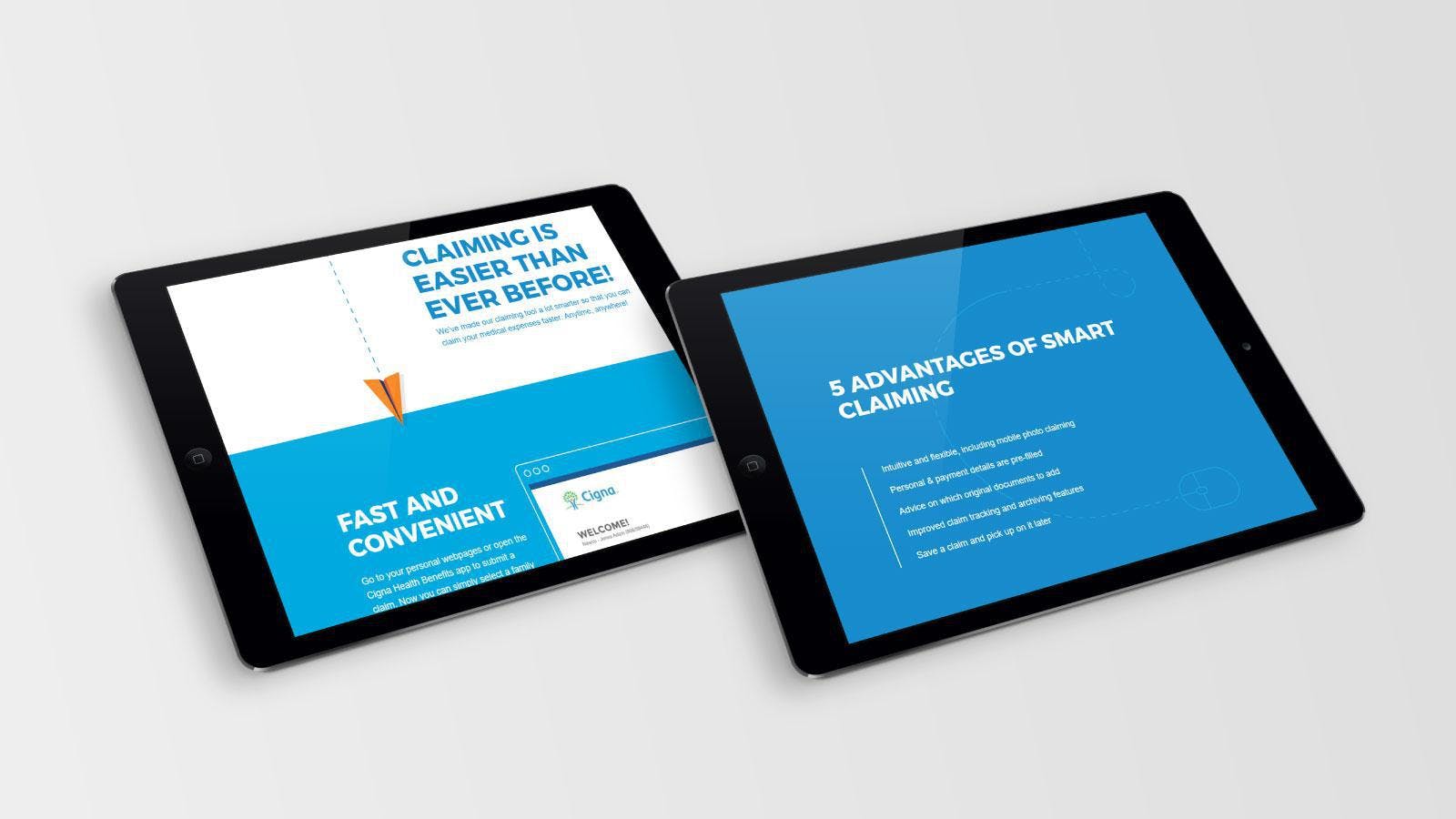
When health insurance provider Cigna was planning to implement some improvements to their claiming process, they asked us to create a dedicated microsite to inform their global target audience.
We created a light design for the microsite in line with the Cigna corporate guidelines. In cooperation with Cigna we also wrote the online copy, focusing on the key arguments for the updated claiming method.
In addition, we designed and drafted e-mails for the target group to get people to visit the microsite.
The campaign microsite was conceived as a one-pager consisting of six very brief main sections. Rather than trying to inform people with exhaustive, in-depth arguments in favor of the new claiming process, the microsite aims to create awareness first. The threshold is deliberately kept low, knowing that today’s audiences read less and less.


