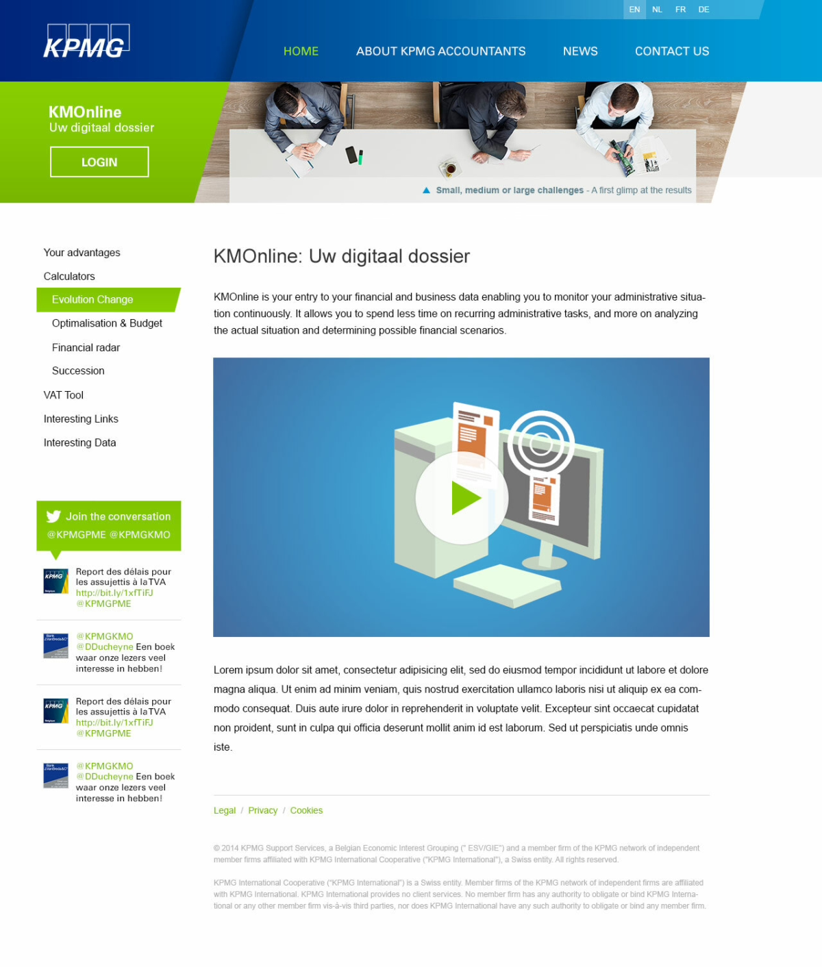
Accountancy firm KPMG called on our online expertise for a marketing campaign. We built two microsites aimed at specific target audiences.
Optimized user experiences
The overall marketing campaign had a clearly defined visual language, so we designed the microsites to fit within that framework. In terms of UI and UX, KPMG relied on our experience and skills to maximize the impact for the two target groups: small and medium size business on one hand, and big multinationals for the other microsite. Obviously we designed and structured both microsites to be responsive, so that mobile use was not an issue.


