Diversity is one of the key characteristics of ADM’s business network. So when ADM asked us to help them rebrand their identity, we wanted to capture the way ADM builds bridges between professionals from all walks of life.
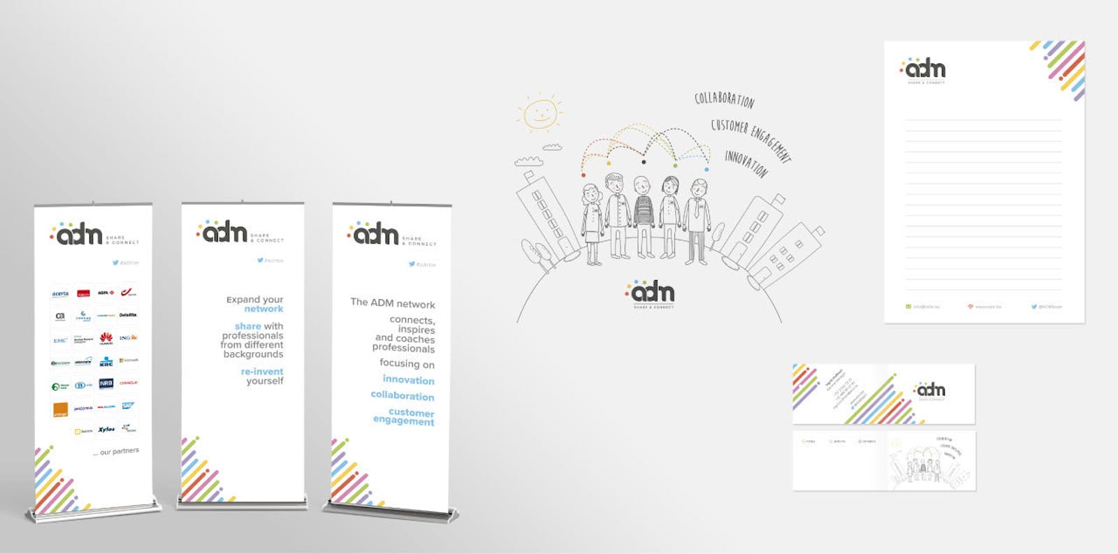
All organizations need a visual anchor, so we started out by designing the new ADM logo. We chose a clean, round and open font for the logo to reflect ADM’s collaborative and informal character. Colored dots were added to express the diversity of ADM’s community and activities.
Based on the logo we then designed the new ADM website. Obviously we ensured responsiveness and we added a special touch by positioning the menu on the left, in line with the direction in which people read.
ADM also asked us for something to easily convey what they stand for and do. So we created a cartoon animation with an inspiring, upbeat tone that can be used on multiple platforms. Of course it was shown at the launch event, but we also incorporated it in the home page of the new ADM website. Roll-up banners and fresh business cards complemented the new ADM outfit.