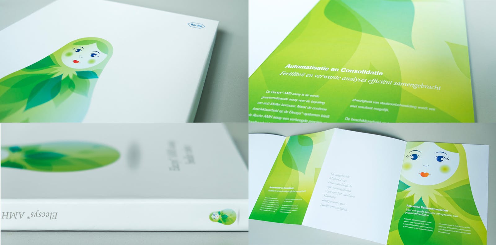
Roche Diagnostics makes products for diagnosing illnesses and conditions affecting women. To market this broad portfolio coherently while still allowing for categorization, they asked us to conceive a unifying visual identity that was suitable for all sorts of media, from print to mobile.
Distinctive yet uniform
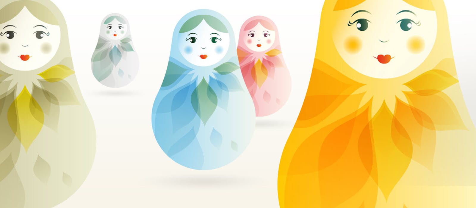
In response we designed a modern variant of matryoshka nesting dolls. Folkloristic details were removed, thick lines turned into delicate gradients, and soft curves were added to reinforce femininity. The intrinsic hierarchy of the nesting dolls was abandoned, but we retained their implicit union to symbolize the connection between the Roche Diagnostics products. Colors distinguish products and life phases, and make this recognizable and highly versatile range also expandable.